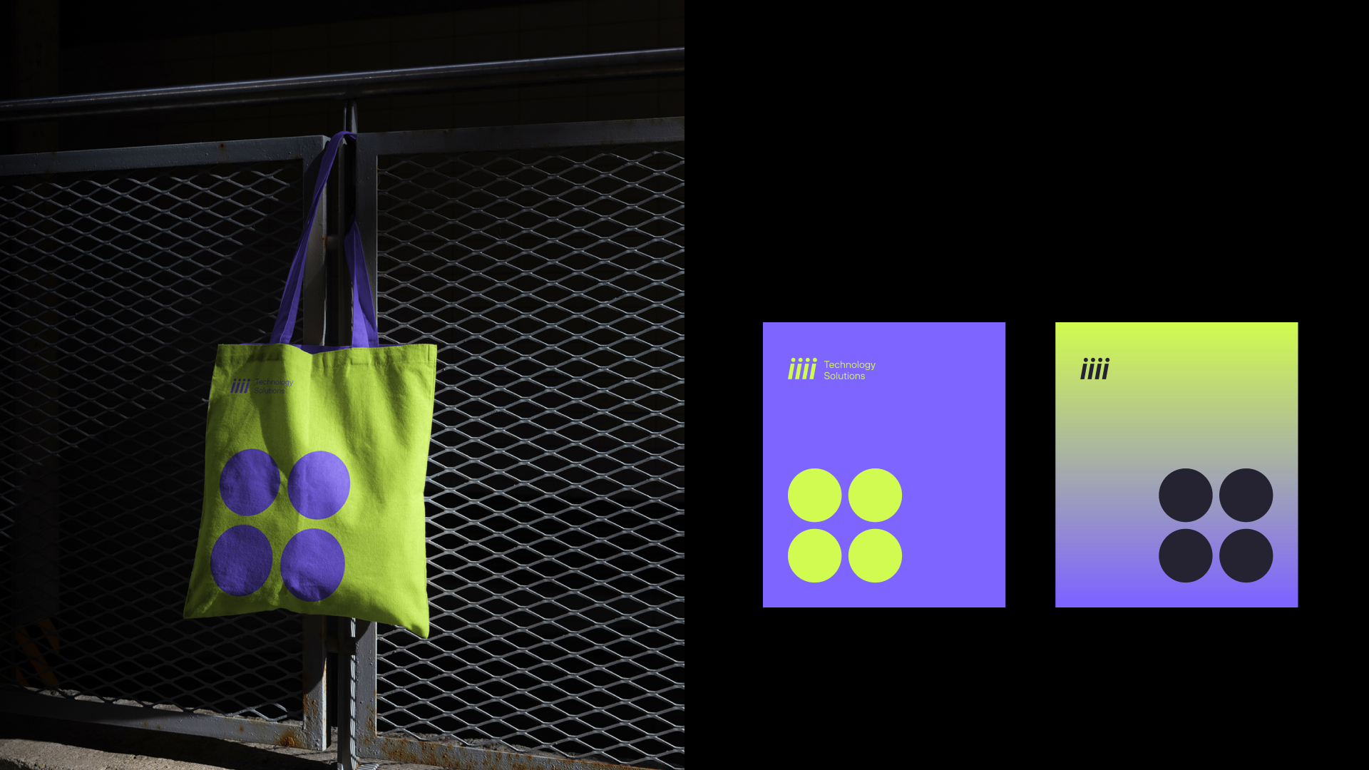
I 2020 fusjonerte Tieto og Evry til ett konsern. Kort tid etter ble den regionale divisjonen skilt ut som et selvstendig merke—og trengte en rebrand, raskt.
Vi jobbet tett med markedsteamet: sosiale medier, copywriting, UI, kreativ direktør. Før noen designbeslutninger ble tatt, gjennomførte vi merkevareassosiasjonsøkter med en designmetodikk som utenfra kan virke nesten meditativ—et sted mellom strukturert og fri. Ord som gikk igjen: krom, robotikk, tekno-utopi, ny punk. Retningen var klar. Merkevaren måtte føles teknologisk, fremtidsrettet, litt dristig. Men det var en spenning å navigere. Langvarige klienter—store virksomheter som hadde stolt på selskapet i årevis—måtte kjenne igjen noe kjent i den nye identiteten. Samtidig måtte raskt voksende selskaper se en merkevare som snakket deres språk. Seriøse fagfolk og progressive spesialister. Begge, på én gang.
Fra en shortlist med sterke kandidater valgte vi iiii—fire i-er, hver representerer en kjernemerkeverdi kodet i forkortelsen. Fascinerende uten å være obskurt. Ordmerket og symbolet ble bygget fra de enklest mulige elementene, noe som betydde at karakteren måtte komme fra et annet sted. Den kom fra en lett helling—ikke helt kursiv, ikke helt rett—som gir bokstavformene en følelse av bevegelse uten å være påtrengende. Rent, minimalt og stille dynamisk. Det føltes som et dristig valg. Det landet godt, også hos direktørene.
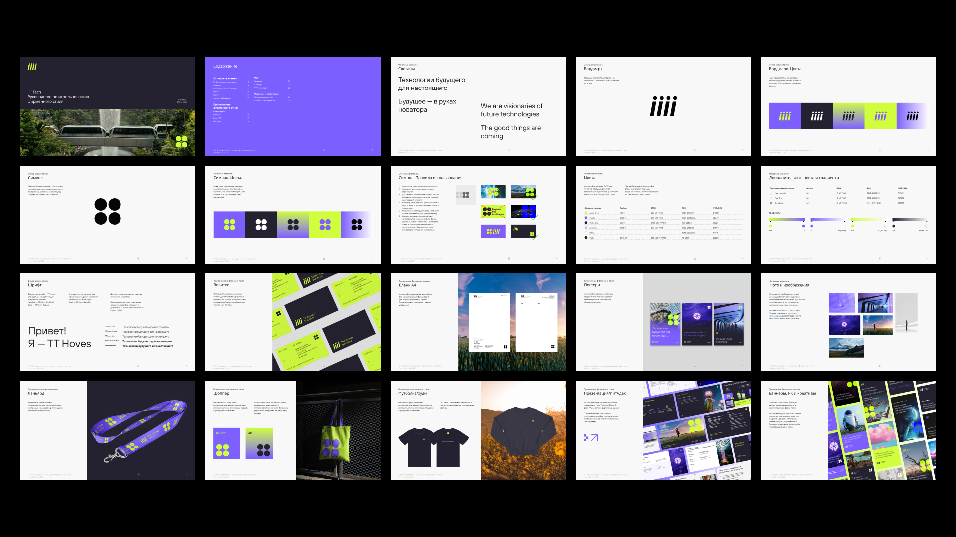
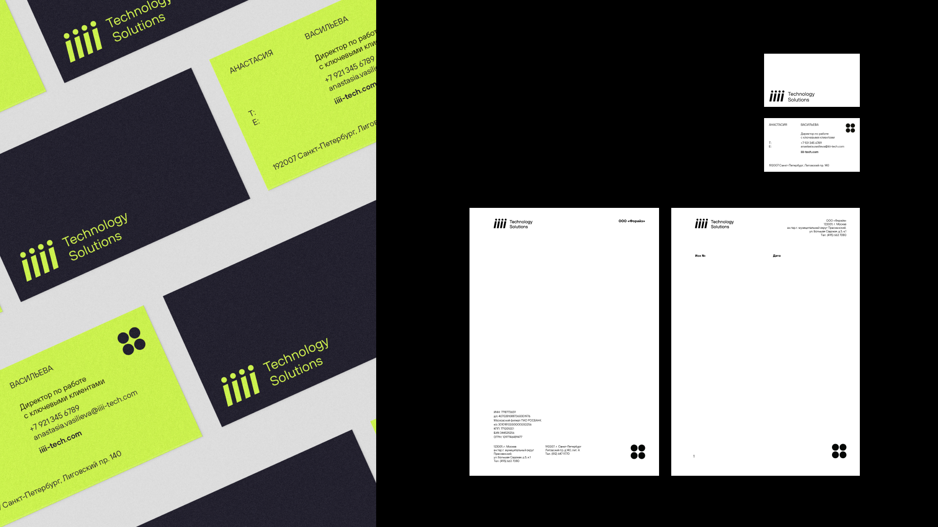
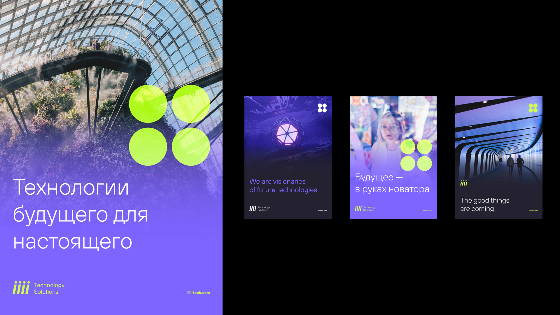
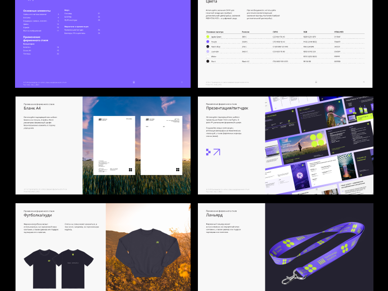
Et komplett designkit fulgte—maler, bruksretningslinjer, logoversjoner i alle fargerom, regler for partnere som bruker merkevareelementer på egne plattformer. Bygget for å brukes av både designere og ikke-designere. Vi utviklet også en midlertidig nettside som var kreativ og oppslukende. Seks måneder senere ble den erstattet av et permanent nettsted bygget av en spesialisert leverandør på merkevarens eksisterende CMS-plattform—jeg konsulterte på merkevareapplikasjon gjennom hele prosessen. Klienten mottok en kortfattet brandbook, et komplett identitetsbibliotek og en kuratert samling av fotografier og ikoner.
iiii Tech—Brand Identity & Web Design
May 13, 2025
Web Design, Marketing