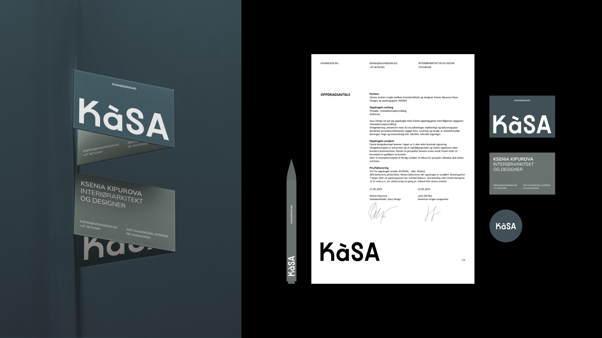
KÁSA er et lite interiørarkitekturstudio basert i Stavanger. De jobber med interiør og eksteriør—bolig og næring—men designer også møbler i begrenset opplag og brukskunstobjekter. Filosofien befinner seg et sted mellom norsk minimalisme og eklektisisme: de leker med farge, eksperimenterer med form og tekstur, lar ting puste uten å bli kaldt.
Klienten kom inn med en klar følelse: seriøst, rent, nesten brutalt. Ingen mykhet, ingen dekorasjon for dekorasjonens skyld. Vi snakket det gjennom sammen og landet et sted mer interessant—brutalisme, men med en liten menneskelig touch lagt til. Akkurat nok til at det ikke skulle føles lukket. Den spenningen endte opp med å definere hele identiteten.
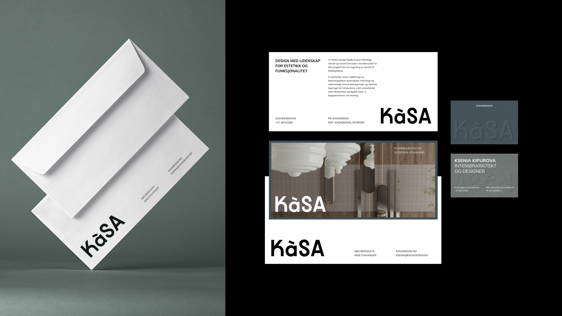
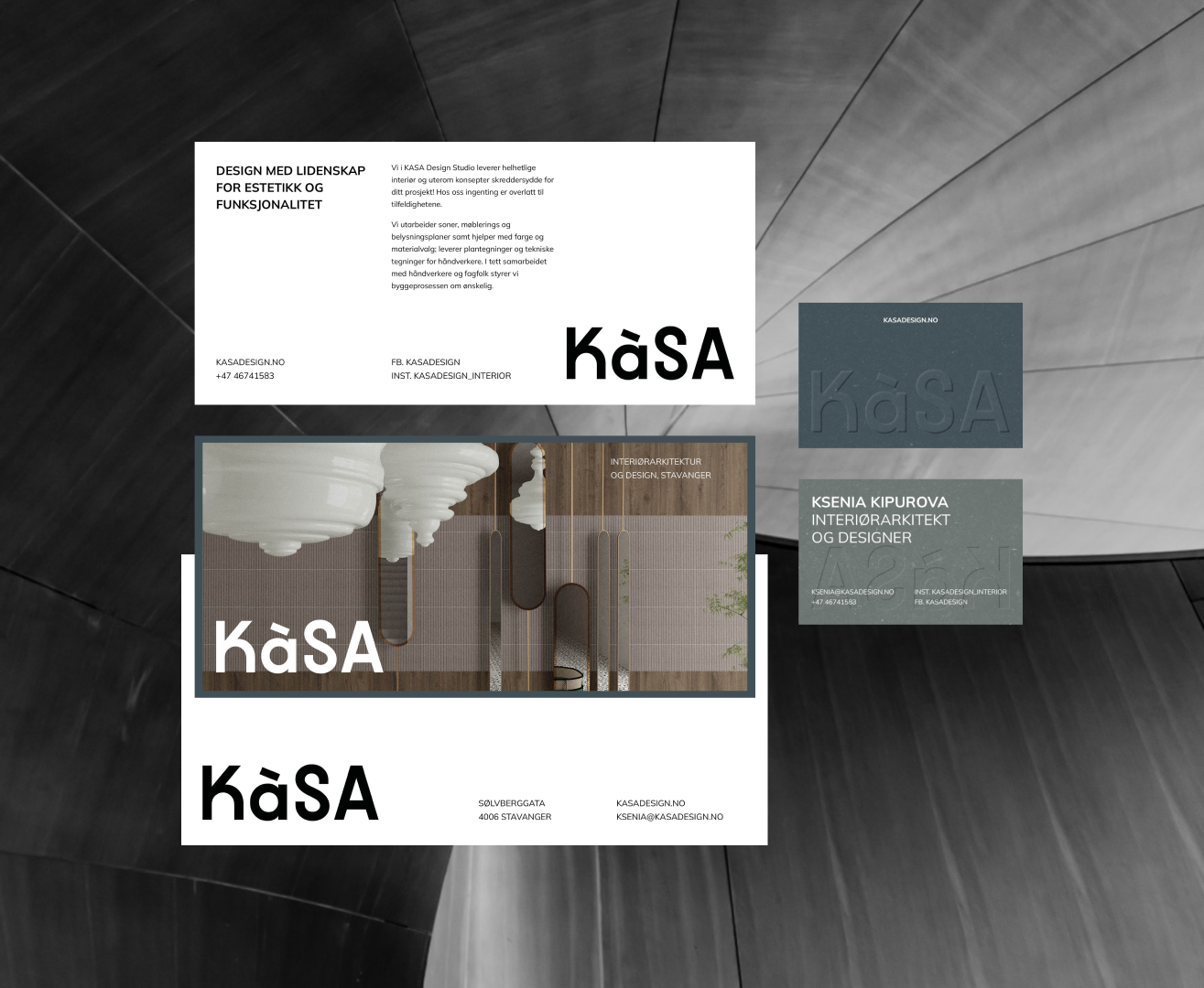
Ordmerket bærer den motsetningen direkte i bokstavformene—runde, nesten vennlige former som sitter oppå tydelige, besluttsomme linjer. Den blandede skriftregisteren i lettering-en legger til et ekstra lag med personlighet uten at det føles lekent på en måte som undergraver seriøsiteten. Og så er det aksenten, et arvestykke fra studiets aller første dager—den bærer ikke lenger sin opprinnelige betydning, men er beholdt som et lite, litt skøyeraktig detalj som passer perfekt inn i helheten.
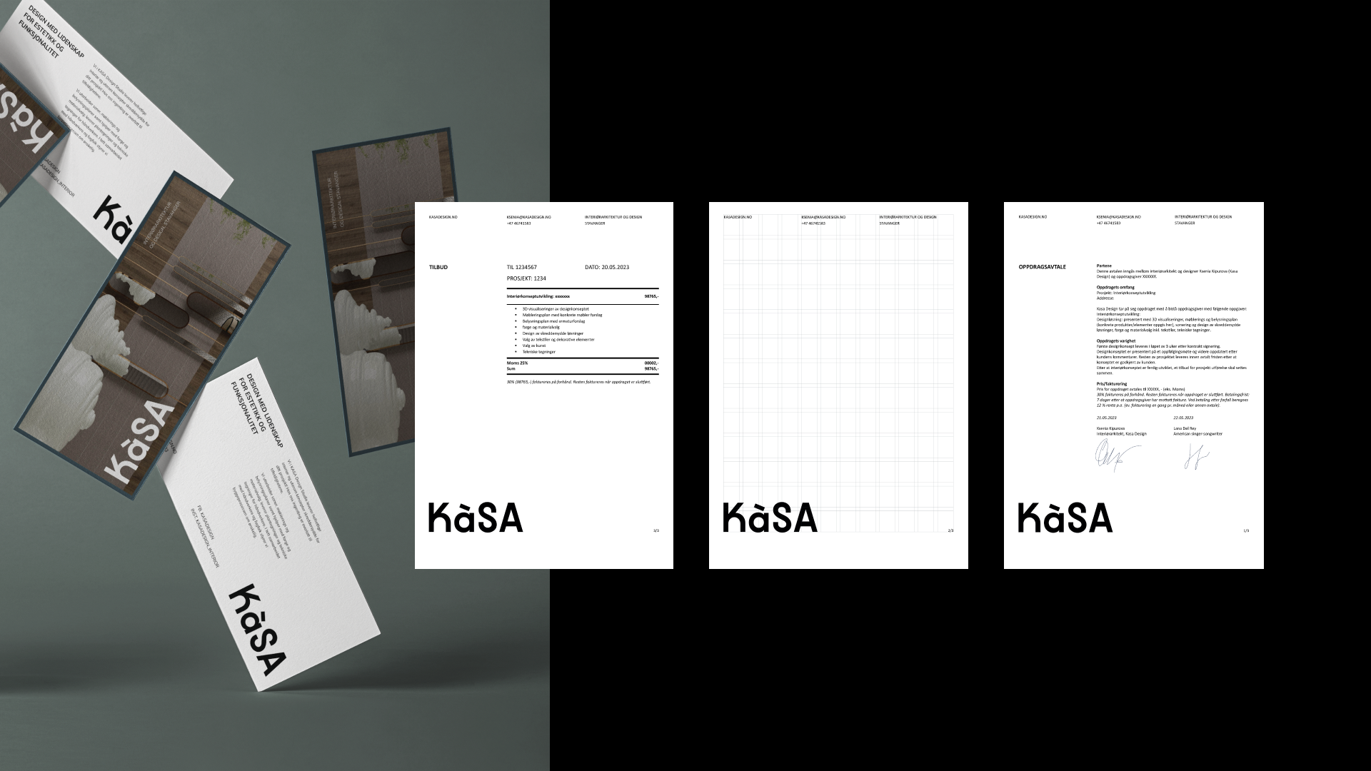
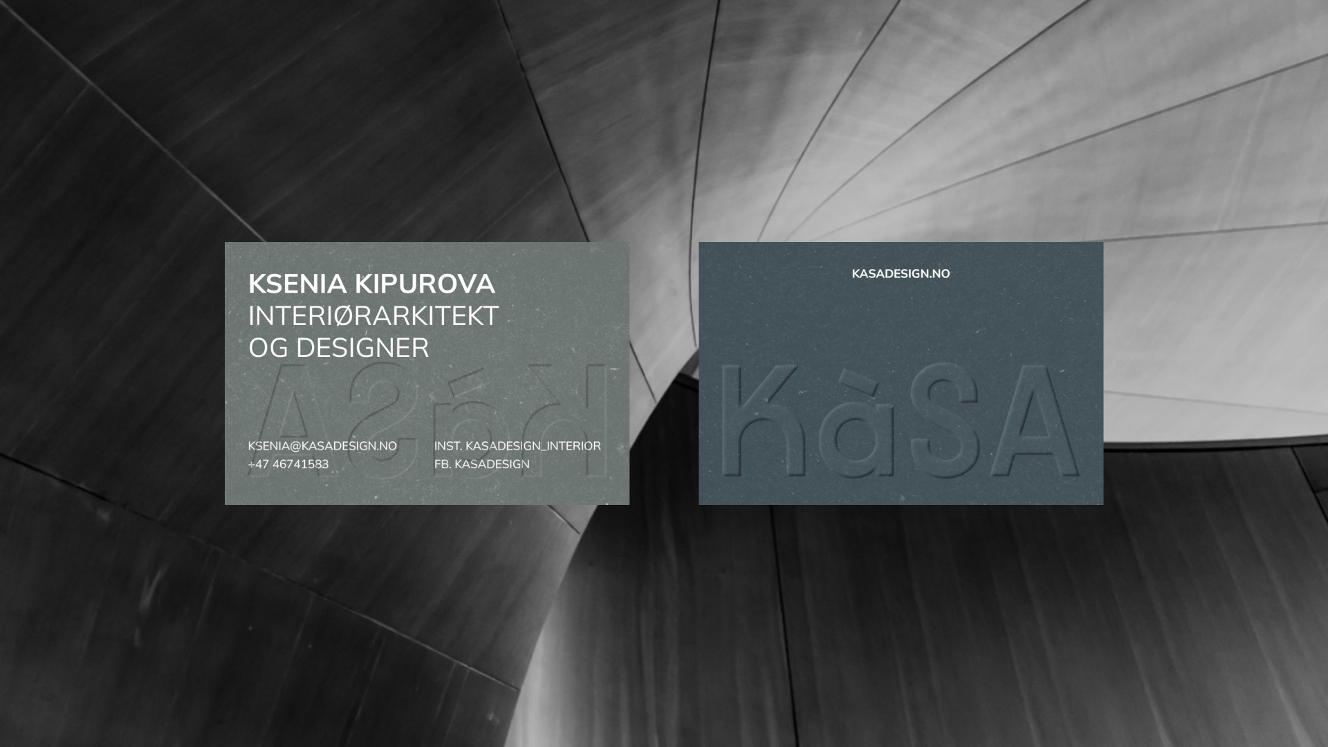
Ved siden av identiteten utviklet jeg et komplett sett med trykksaker—inkludert flyer- og postkortformat—og en fullstendig nettside designet for å presentere studiets fullførte prosjekter og fange opp henvendelser fra nye klienter. Alt ble bygget for å holde den samme balansen som logoen: strukturert og gjennomtenkt, men ikke rigid.
KÁSA—Brand Identity & Web Design
July 14, 2025
Web Design, Marketing